Barriers of Visual Communication
Barriers of visual communication are everywhere, even when we least expect them. I’ve always believed that a picture can say more than words ever could, but these barriers can stop your message from getting through. Visual communication grabs attention and tells a story in a way text alone just can’t match. But even the most eye-catching visuals can fall flat if certain obstacles get in the way.
From creating presentations to sharing on social media, I’ve noticed how easily visual messages get lost, misunderstood, or even ignored. Differences in culture, technology, and audience knowledge can all prevent visuals from connecting.
Understanding the Barriers of Visual Communication
Visual communication barriers are obstacles that limit clarity, cause misinterpretation, and reduce the overall impact of images, graphics, or videos. Let’s explore the most common ones and why they matter.
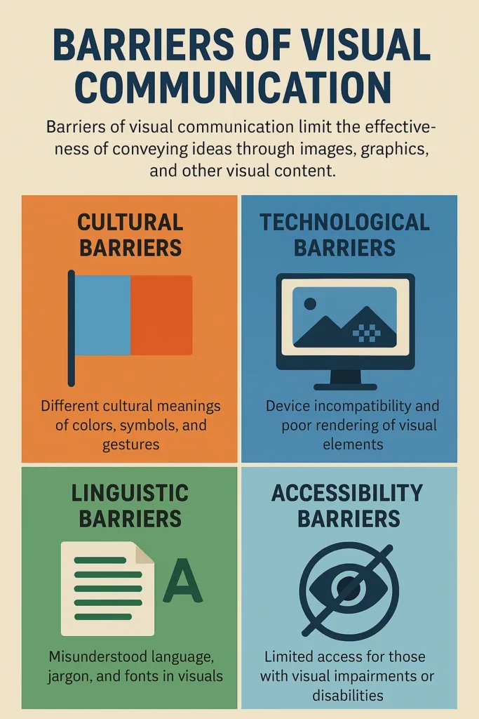
Cultural Barriers
Visual symbols and colors don’t have universal meanings. For example, red stands for luck in China, but means danger or warning in many Western cultures . Even hand gestures or animal images can offend or confuse audiences if the cultural context isn’t considered. Without cultural awareness—or “cultural semiotics”—well-intended visuals can miss their mark or even alienate viewers.
Perceptual Barriers
We all interpret visuals differently, based on experience and personal biases. An ambiguous icon or complex infographic can be read in more than one way, leading to misunderstanding. This is where visual literacy comes in—the skill to interpret and create meaning from images. Not all viewers have the same level of visual literacy, so clarity and simplicity are essential.
Technological Barriers
Not all viewers use the same devices or software. Low-resolution images might look pixelated on large screens, and text-heavy infographics can be impossible to read on smartphones. Compatibility issues, slow loading times, and poor optimization for different platforms are common tech barriers. For people with disabilities, visuals that lack proper alt text or screen reader support are simply inaccessible.
Linguistic and Literacy Barriers
If visuals rely on complex language, dense text, or industry jargon, many viewers will feel left out. Not everyone shares the same reading skills, and language barriers can leave international or low-literacy audiences confused. This is especially important for infographics, charts, and diagrams.
Contextual Barriers
Sometimes viewers just don’t have enough background knowledge to understand what they’re seeing. Technical diagrams, “inside jokes,” or niche cultural references will confuse anyone who’s not already in the loop. Visual communication should always meet people where they are.
Information Overload
Cramming too much data or too many elements into a visual creates information overload. Overwhelmed viewers won’t know where to look or what’s important. This cognitive overload is one of the fastest ways to lose your audience.
Impact of Barriers on Effective Communication
Barriers of visual communication directly decrease message clarity and lower audience understanding, as seen in cases with cultural, perceptual, technological, linguistic, and contextual obstacles.
- Misinterpreted colors, symbols, or gestures cause misunderstandings and alienate viewers from different backgrounds. I’ve seen design projects fail audience engagement when cultural meanings weren’t researched.
- Visuals interpreted differently by individuals create inconsistent understanding. For example, ambiguous icons or symbols disrupt cohesive message delivery.
- Device incompatibility or low-resolution graphics result in distorted visuals and information loss. I encounter this with infographics that display incorrectly on some platforms or devices.
- Unclear text, complicated terminology, or unfamiliar languages confuse viewers and restrict access to message content. Visuals with text overlays often lose effectiveness when audience members lack required language proficiency.
- Lack of background knowledge or situational cues leads to partial or incorrect interpretation. For instance, visuals relying on insider knowledge exclude broader audiences and decrease communication reach.
Barriers of visual communication lower engagement rates, increase the risk of misinterpretation, and diminish feedback quality. In my experience with presentations and social media, feedback drops when visuals don’t match the audience’s expectations or technical limitations restrict their access. These impacts, measured in response rates and user comprehension metrics, show a direct correlation between unresolved barriers and reduced visual message effectiveness.
Essential Strategies to Overcome Visual Communication Barriers
Promote Visual Literacy
Start with your audience’s ability to read images, not just text. Use familiar symbols, provide clear legends, and explain complex graphics. For important visuals, consider adding brief guides or how-to captions to help all viewers make sense of what they’re seeing.
Make Accessibility a Priority
Accessibility is fundamental, not optional. Following standards like WCAG and national accessibility laws is essential. Here’s how to make visuals more accessible:
- Use alt text: Every image should have a descriptive alt tag for screen readers.
- Design for color blindness: Don’t rely on color alone to convey meaning. Use patterns, labels, and check combinations with tools like WebAIM’s Contrast Checker.
- Readable fonts and clear contrast: Avoid decorative or small fonts, and ensure strong contrast between text and background.
- Captions and transcripts: For videos and complex graphics, provide captions, transcripts, or descriptive summaries.
Apply Universal Design Principles
Universal design means making visuals that everyone can access and enjoy, regardless of ability. This includes:
- High-contrast layouts
- Flexible font sizes
- Touch-friendly elements for mobile users
- Consistent iconography that doesn’t depend on cultural knowledge
Reduce Information Overload with Visual Hierarchy
Good visuals guide the viewer’s eye naturally from the most important element to supporting details. Achieve this by:
- Using larger, bolder text for key points
- Grouping related elements together
- Leveraging white space to let content breathe
- Keeping one main idea per graphic
Test for Clarity Across Cultures and Contexts
Never assume a visual means the same thing to every audience. Before publishing, check your designs with a diverse group—either through informal feedback or user testing. Use tools like Google’s Market Finder to research meanings in different countries.
Implement User Testing and Feedback Loops
Real users are the ultimate test. Run A/B tests, quick surveys, or focus groups to see how people actually interpret your visuals. Analyze feedback and make changes. Iterative design—where you refine based on real responses—improves clarity and accessibility over time.
Leverage Digital Tools and Resources
There are plenty of resources and tools to help overcome visual communication barriers:
- Canva Accessibility Design: Tips and templates for accessible design.
- WebAIM Contrast Checker: Test color contrast instantly.
- Loomly: Organize and optimize visual content for all platforms.
- Color Oracle: Simulate color blindness on your screen.
Plan for Emerging Media: AR, VR, and Video
New visual formats like augmented reality (AR), virtual reality (VR), and video are changing the way we communicate. These media bring their own challenges, like motion sensitivity, audio cues, or device limitations. Always consider accessibility and test across multiple platforms.
Think About Emotional Impact
Visuals are powerful emotional tools. Be mindful that colors, images, or symbols may evoke unintended emotions. Test your visuals with diverse audiences to ensure you’re sending the right message, especially in campaigns meant to inspire or comfort.
Legal Compliance and Ethics
Don’t forget, accessibility isn’t just good practice—it’s often required by law. Businesses in the U.S. must comply with the ADA, and international organizations face similar requirements. Ethical communication also means being honest and avoiding misleading visuals or manipulative data displays.
Quick Checklist for Effective Visuals
- Have you used alt text and/or captions for every image or video?
- Are your colors and fonts accessible and easy to read?
- Is your main message clear at a glance?
- Have you tested your visuals on different devices and with diverse users?
- Did you check for cultural misinterpretations?
- Are your visuals compliant with accessibility standards?
- Have you avoided information overload by focusing on a single key message?
Conclusion
Addressing the barriers of visual communication takes ongoing effort and self-awareness. I know that even the most carefully crafted visuals can fall short if I overlook cultural nuances or accessibility needs.
By staying open to feedback and continuously refining my approach I can make my messages more effective and engaging. Visual communication is a powerful tool and with the right strategies I’m confident it can bridge gaps and connect with any audience.